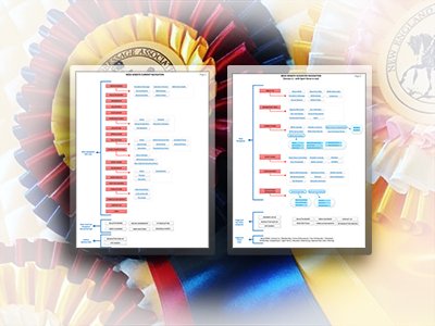
Project Snapshot
- Reduce the navigation to a manageable structure based on top member tasks
- Surface utility navigation (login, member portal) in the header where users expected it
- Eliminate duplicated links and map all existing content to a single canonical location
- Deliver recommendations immediately actionable by a non-technical team
- Preserve all existing content within the constraints of the new CMS templates
18 main navigation items reduced to 6 logical categories. Duplicated links eliminated. Hidden content made discoverable. The redesigned site won First Place — Best User Experience from the United States Dressage Federation.
The 47-Link Homepage Audit — The fastest way to align a non-technical client on the scale of the problem was to count it. Documenting 47 clickable elements on the homepage and 18 top-level nav items turned an abstract "it feels confusing" into an undeniable mandate for change.
Problem & Goals
The New England Dressage Association (NEDA) — the largest single-chapter American dressage organisation and USDF's largest single-chapter GMO — was migrating to a new hosting vendor and CMS. This was an opportunity to address long-standing usability problems that had accumulated as the website grew organically over years without a unified information architecture strategy.
The homepage alone contained 47 clickable links and buttons. The left navigation had 18 main buttons with 6 additional navigation buttons across the top. Utility functions like newsletter sign-up and site search were buried in the bottom-left corner — a location users never look. Critical content was duplicated across multiple nav items, while other valuable member resources were effectively hidden.
What I Was Asked To Do
The CMS came with design templates, so visual redesign was off the table. My focus was entirely on: analysing the taxonomy and content organisation, identifying the top member tasks, and providing a heuristic report and IA recommendations to guide the restructure.
Constraints
- CMS design templates were fixed — no custom visual design
- All existing content had to be preserved and mapped to the new structure
- The team was non-technical — recommendations had to be immediately actionable
- The project was lean — analysis, recommendations, and implementation guidance only
Research & Insights
My analysis began with a thorough review of the existing site — documenting every navigation element, identifying where content lived, where it was duplicated, and where user tasks were being underserved. I also worked with the NEDA team to identify the top 5 primary member tasks and top 5 secondary tasks, which became the ordering principle for the new navigation.
Design Decisions
The core design principle guiding every recommendation: navigation should reflect the mental model of the user, not the internal organisational structure of the association. Every item in the nav needed to earn its place based on member task frequency, not internal politics or historical habit.
Taxonomy Analysis
The taxonomy analysis documented the full existing navigation structure — every main item, every sub-item, every utility link — and mapped it against the proposed new structure. Presented side by side, the before/after comparison made the scope of the reorganisation immediately clear to the NEDA board and the development team.
The analysis also identified content that existed on the site but was difficult or impossible to find through normal navigation — items that would benefit from being surfaced in the new structure or cross-linked from multiple relevant locations.
The taxonomy document was delivered as a formal written report alongside the visual navigation diagrams, providing the NEDA team with both an actionable visual reference and a written rationale for each recommendation. The report became the working document for the CMS implementation team.
Before & After
The transformation is visible side by side. The original site's dense, unordered navigation — with duplicated links, buried utilities, and no clear hierarchy — became a clean, task-oriented structure. The new site's top navigation immediately reflects what members actually come to do.
The Outcome
The result was recognised formally by the United States Dressage Federation — NEDA won First Place in the GMO Website Awards for Best User Experience in the category of GMOs with 500 or more members. This was the direct outcome of the heuristic evaluation and IA restructure.