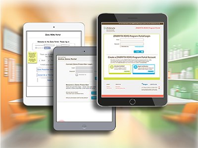
Project Snapshot
- Replace fax/paper enrollment with an immediate online certification and patient enrollment flow
- Enable doctors to delegate administrative tasks to nurses including patient management and form completion
- Support DocuSign batch signing without disrupting doctors' preferred workflow
- Build admin tools for patient status management and lab result tracking
- Navigate and align nine stakeholders across technical and non-technical disciplines
Delivered a fully functional REMS portal with DocuSign integration, doctor-to-nurse delegation, and immediate HCP certification. Positive testing results shifted the organisation toward prioritising user needs in future healthcare digital products.
DocuSign Batch Signing — Doctors needed to sign multiple patient forms without losing their existing batch workflow. We designed a DocuSign integration that preserved that pattern — removing the biggest source of anticipated resistance.
Research & Insights
The stakeholder environment was the most complex I had worked in. On the non-technical side: a Product Manager, Therapy Owner, Compliance, Regulatory, Legal, Brand, and Marketing. On the technical side: Enterprise Architecture, a Development team, a Design Agency, and a Business Analyst. My role as UX Strategist was to lead cross-functional discussions using a user-centered design process — with all stakeholders present simultaneously.
We designed for three audiences: prescribers who needed to certify and sign, nurses who managed the day-to-day compliance and enrollment work on their behalf, and patients whose safety monitoring was the whole point of the program.
"At the end of the day the nurse brings a pile of paper forms I must sign all at once. I like this process, it is easy, I don't want to lose that."
— Doctor, during user testingThis quote defined the design challenge perfectly — we weren't just digitising a process. We were redesigning it in a way that preserved the doctor's familiar batch-signing workflow while giving nurses the tools to manage everything else independently.
Sketches & Screen Flows
Sketches
I started with rough sketches — filling 5 to 6 notebooks throughout the project with notes, questions, design decisions, and UI concepts. Sketching quickly in every stakeholder session meant ideas were captured in real time rather than reconstructed later.
Screen Flows
Wireflows mapped the key use cases — new patient enrollment, new prescriber certification, and the migration path for prescribers who previously enrolled by fax or phone. These were essential for stakeholders to understand the full scope of the system.
Wireframes & Prototype
Wireframes
Once the team aligned on basic requirements and information architecture through the lo-fi prototype sessions, I moved to medium-fidelity. These wireframes served double duty: as a higher-fidelity prototype for nurse user testing, and as a handoff specification for the visual design agency.
Prototype
The prototype approach was central to the process. Rather than traditional wireframes reviewed in isolation, I brought a working lo-fi prototype to every sprint. Stakeholders reacted to real interactions, not static screens — and Legal and Compliance could flag issues before they became coded features.
System Map
The system map was a critical communication tool for this project. The application was large and complex — enrollment, certification, patient management, lab tracking, delegation, and admin functions across multiple user roles. The system map gave leadership and engineering a high-level view of the full scope before any development began.
Design Decisions
We ran two design sprints per week throughout the project. Each sprint introduced the user and task, demonstrated the current prototype, and generated structured discussion. The sprint cadence was essential for moving fast in a waterfall project environment with slow-moving legal and regulatory approval cycles.
Final Design
Visual design was handled by a design agency working from the medium-fidelity wireframes I produced. My role shifted to art direction — ensuring the visual layer preserved the interaction model and UX decisions made during prototyping, and that the brand and regulatory requirements were correctly applied.
The final portal was designed for tablet-first use — nurses and doctors in the office setting typically used iPads. Screens were shown in device frames to help stakeholders understand context of use during reviews.